Publishing runs on a shared document specification, refined over a century of slush piles and codified for the modern era in William Shunn's canonical guide, and it survives because it solves real problems: a standardized page holds a predictable word count, double spacing leaves room for annotation, and uniformity means the only variable between two manuscripts is the writing. That last point is the one to internalize. An agent reading fifty submissions a week can spot a non-standard manuscript before reading a sentence, and while format alone rarely earns a rejection, it reliably earns a first impression, and the impression it makes is "doesn't know the business yet."
The full specification fits on a page. Here it is, with the reasoning, so none of it needs memorizing.
The core specification
| Element | Standard |
|---|---|
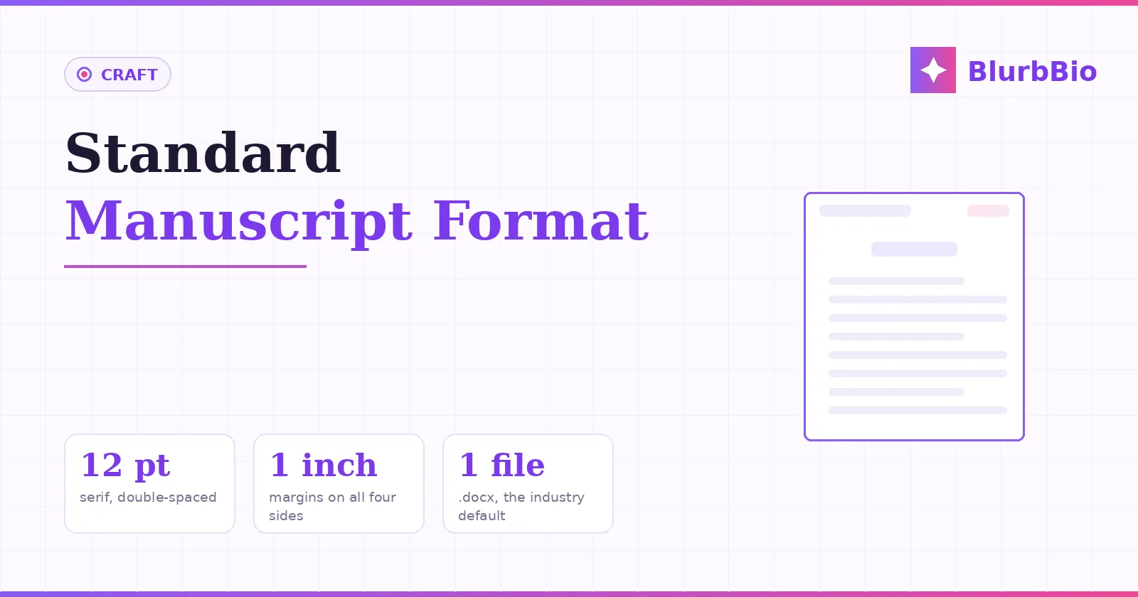
| Font | 12-point Times New Roman (any clean serif acceptable; TNR is the safe default) |
| Spacing | Double throughout; no extra space between paragraphs |
| Margins | 1 inch, all four sides |
| Paragraphs | First line indented 0.5 inch via paragraph settings, never tabs |
| Alignment | Left-aligned (ragged right), never justified |
| Header | Surname / Title keyword / page number, top right, from page 1 of the text |
| Chapters | New page each; heading about one-third down; first paragraph unindented |
| Scene breaks | Centered # on its own line |
| Emphasis | Italics as italics (the underline-for-italics convention is a typewriter relic) |
| File | .docx, named Lastname_TITLE.docx unless guidelines say otherwise |
Two of these rules do more silent damage than the rest when broken. Paragraph indents built with the Tab key and spacing built with blank lines are visible to anyone working in the file, and they announce hand-formatting; both belong in the paragraph style settings, set once for the whole document. And justified text, which looks "book-like" to authors, is wrong here precisely because a manuscript is not a book: it is a working document, and ragged right is easier to read line-by-line and annotate.
The title page and the front of chapter one
The title page is a business document: contact block top left (legal name, address, email, phone; agent details instead if agented), word count top right rounded to the nearest thousand, and the title centered a third to halfway down with your author name beneath it, pen name here if you use one, legal name in the contact block. Nothing else. No cover art, no epigraph, no copyright line, the last of which is the classic amateur tell, since copyright exists automatically and asserting it at an agent implies distrust.
The manuscript text then begins on the next page, with the header starting there (the title page goes uncounted and unnumbered), chapter one's heading a third of the way down, and its opening paragraph flush left, unindented, the traditional signal of a fresh start that also governs the first paragraph after every scene break.
Scene breaks, chapter breaks, and the machinery
Scene breaks get a centered # on its own line rather than a plain blank line, because blank lines vanish when they land at the top or bottom of a page and take your carefully placed white space with them; the # survives pagination. Chapters start via a page break inserted from the menu, not a stack of returns that will drift the moment anything above it changes length. And italics are typed as italics: the old convention of underlining for italics belongs to typewriters and the markets that still remember them, and modern novel submissions simply use the real thing.
None of this machinery is aesthetic. Every rule traces to how the document gets used downstream: read fast, annotated between the lines, searched, and estimated. Which is also why the rules relax the moment the document stops being a working manuscript, and why the published book's interior, trim sizes, running heads, drop caps, real typography, is a different discipline entirely, covered in our print formatting guide.
Guidelines override everything, and the export habit
A note on the word count you print on the title page: use your word processor's actual count, rounded to the nearest thousand. The old typewriter-era estimate (250 words per page times page count) survives in some short-fiction markets, but novel publishing has standardized on the real number, and the rounding matters only for honesty at the margins; nobody distinguishes 92,000 from 92,300, but everyone notices a 140,000-word manuscript labeled 120,000 when the file opens. International submissions follow the same core specification with local paper sizes (A4 outside North America) and the occasional house rule; the format described here is understood everywhere English-language publishing operates.
The final rule ranks above all the others: the recipient's submission guidelines win. An agent requesting single-spaced sample pages pasted into an email body gets exactly that; a magazine specifying its own font gets its font. Standard format is the default that applies where guidelines are silent, which is most of the time, and following stated guidelines precisely is itself the strongest professionalism signal available, because it demonstrates the thing agents are actually screening for: an author who can follow the process.
Practically, the sane workflow is to write however you like and treat standard format as an export target: draft in your tools of choice, then produce a clean .docx in standard format when submission time comes, checked against the table above, with the query letter and synopsis that travel beside it. The format takes twenty minutes to apply and buys the one thing every submission needs most: a first page where the only thing an agent can notice is the writing.
See also: How to Write a Query Letter · How to Write a Synopsis · Book Formatting for Print · How to Write a Novel: The Complete Guide