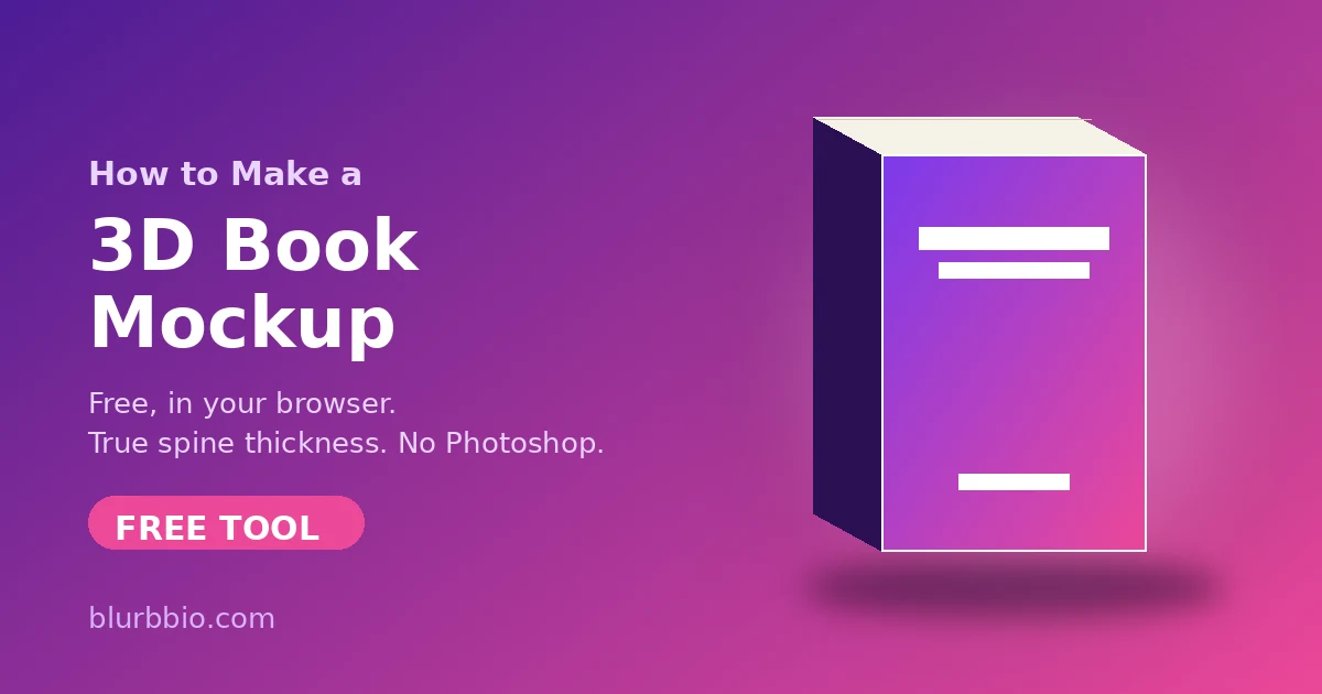
A 3D mockup turns a flat cover file into something a reader can imagine holding, and the difference shows up everywhere the book is sold: social posts, your website, newsletter headers, ads, even the "look inside" teaser. Publishers have always known this, which is why traditional marketing kits are full of angled product shots rather than flat art.
The good news is that the tooling caught up. You no longer need Photoshop actions, a Placeit subscription, or a designer on retainer. A modern browser can render a physically plausible book, with your real spine width, in real time. What follows is the complete workflow, including the parts most guides skip: the numbers that make a mockup look right rather than merely present.
What you need before you start
Three things, and only the first requires any effort:
Your cover file as an image. PNG or JPG, ideally 1600 pixels or wider on the short side. If your designer delivered a PDF, export it as PNG first. You can work with just the front cover, but if you have the full print wrap (back, spine, front in one file) or all three faces as separate files, the mockup gains a real back cover and spine art instead of a solid color.
Your trim size. The finished page dimensions: 6 x 9 inches is the trade default for adult fiction, 5.5 x 8.5 and 5 x 8 are the compact alternatives. If you have already been through print formatting you know this number cold; if not, the print formatting checklist covers how to choose.
Your page count and paper stock. This pair is what most mockup tools ignore, and it is exactly what separates a believable render from an obviously fake one.
Why the spine is the whole game
Spine width is arithmetic: page count multiplied by the paper's per-page thickness. A 301-page book on white paper is 0.678 inches. The same book on cream paper is thicker; a 500-page epic on cream approaches 1.2 inches.
The single biggest tell of an amateur mockup is a spine that could not exist: a 120-page novella rendered as a two-inch brick, or a doorstopper thin as a pamphlet. Readers may not name what is wrong, but they register it, the same way an eye catches a photoshopped shadow falling the wrong way.
So use a tool that computes the spine from your real numbers rather than a template with a fixed-width smart object. Enter page count and paper stock once and the book renders at the thickness your readers will actually hold. If you want to sanity-check the math itself, or you need the number for your cover designer, the Spine Width Calculator gives the exact figure for every major printer along with printable dielines.
Step by step: from cover to mockup
1. Upload your cover. Front only is fine to start. A full print wrap is better: the tool slices it into back, spine, and front automatically using your trim and page count, and re-slices if you change either, so all three faces always fit. Separate front, back, and spine files work too.
2. Set trim, pages, and paper. This locks the book's physical proportions. Everything downstream, from spine thickness to how the book sits in a scene, derives from these three values.
3. Choose a style. A paperback with a slight cover bow reads as a real object. A hardcover with a dust jacket, rounded spine, and visible flaps reads as premium. An open book showing interior pages is the classic look-inside shot. A stack or hero pair suits series marketing, especially if each book carries its own cover. Match the style to the message: single paperback for a launch post, jacketed hardcover for a special edition, open book for showing off your formatting.
4. Light it. Two controls do most of the work: the light's direction and its height. Low light with hard shadows reads as late-afternoon sun; high light with soft shadows reads as a studio softbox. If you would rather not think about it, presets like Studio, Golden hour, and Moody apply coherent rigs in one click.
5. Set the scene. A clean studio backdrop is safe and versatile. A soft brand color behind the book makes a series feed cohere. Or drop the book into a real photo, your desk, a bookshop table, a cafe scene, and let the tool match the book's lighting to the photo so the composite holds together.
6. Export. This is where format discipline pays off.
The export kit: what to render for each platform
One image is not a launch kit. Render the set once and file it:
A 2000 pixel square for your website, newsletter, and most ad platforms. 1080 x 1350 for Instagram feed posts, the 4:5 portrait that claims the most screen. 1080 x 1920 for stories and reels. 1200 x 630 for the link preview that appears when anyone shares your book page. A transparent PNG cutout for compositing into your own graphics later.
Then video, which outperforms stills nearly everywhere it is allowed: a 3-second rotation loop for reels, a 6-second showcase sway for ads, a 10-second zoom reveal for the cover announcement. H.264 MP4 plays everywhere, including iMessage previews, which WebM does not.
If that list sounds like an afternoon of work, it is not: a one-click shot set can cycle styles, angles, backdrops, and lighting and hand you a dozen-plus finished images while you make coffee.
Mistakes that flatten a mockup
The impossible spine, covered above, is the big one. After that:
Wrong aspect ratio for the platform. A square image cropped by Instagram into 4:5 loses your title or your author name. Export at the target size instead of letting the platform decide what survives.
Lighting that disagrees with the scene. A book lit from the left dropped into a photo lit from the right never composes, no matter how clean the cutout. Match the light direction to the scene, or use a tool that samples the photo's lighting automatically.
Over-glossy everything. Real matte covers scatter light; real gloss lamination reflects it in a specific, thin-film way. If your finish will be matte, render it matte. It is a detail, but details are the whole reason to use a 3D render over a flat rectangle.
One image, reused forever. The marginal cost of variations is now zero. A different angle for the newsletter, a stack for the series post, an open-book shot for the formatting reveal: variety keeps a feed alive without new design work.
Where this fits in the launch sequence
Mockups slot in earlier than most authors think. Cover reveal posts want the hero render. Preorder ads want the video. The newsletter announcement wants the link-preview size so the share looks intentional. And the moment your interior formatting is final, the open-book shot becomes the best proof of production quality you can post, because it shows the actual object readers are buying.
None of this requires leaving the browser, uploading your cover to a stranger's server, or paying a subscription for a template library. The physics, the spine math, and the export formats are all solvable in one place, and the two minutes it takes to render the full kit is the cheapest marketing production you will do for the entire launch.